Brand
The living brand guideline — positioning, identity and how Arete lives in the world.
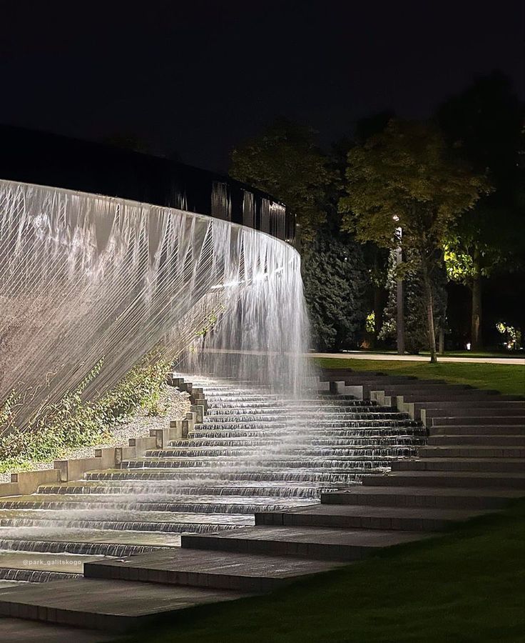
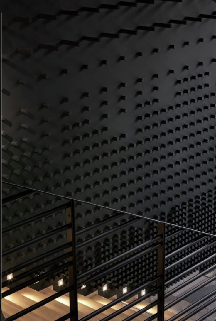
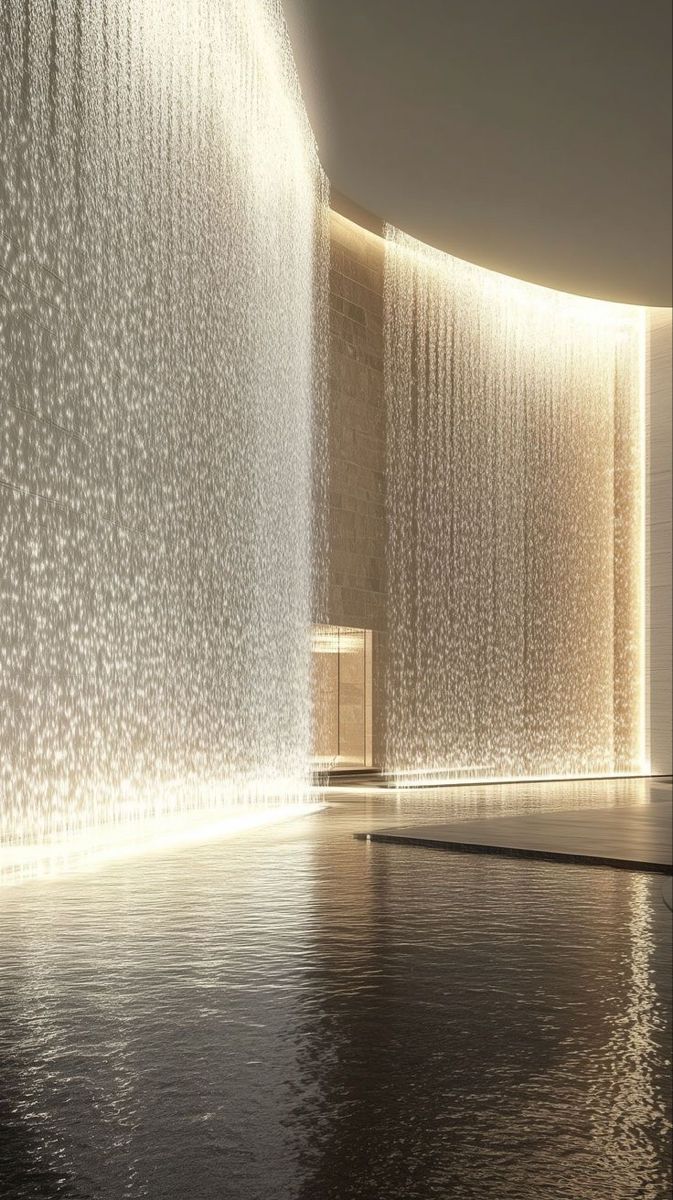
A life worth living. Arete fuses clinical longevity science, training, and stillness into one deliberate practice — engineered, measured, and quietly premium. The architecture carries the weight; the member carries the work; the circle holds them both.
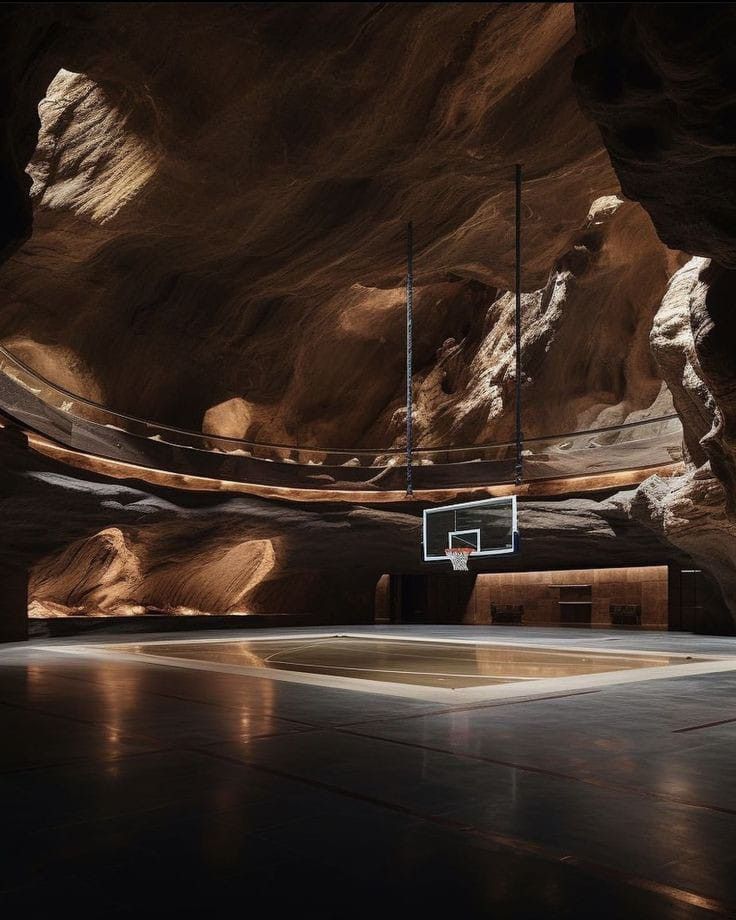
The chrome stays black and white. Colour is borrowed from photography — never decorative, always earned. Imagery is the only place hue lives.
Big, tight, and confident. Headlines carry the weight; everything else stays quiet and out of the way.
The same family runs the interface — labels, metrics, and body. Numbers are tabular so figures line up cleanly.
Placeholder marks — the wordmark holds the space until the final logo is designed.